Sentinel-As-Code: iSOC Blueprint, the docs on a SharePoint page

The Documenter reads the live workspace every day and writes the docs itself, so nobody has to. 26.07 then turned that Markdown into a Word document for people who like their documentation with page numbers.
That left the reading half. The Markdown lives in a pipeline artefact, or in a review-only PR on a private repo. That's exactly where it should live, and exactly where a SOC manager, a service owner or an auditor will never go.
Most of those people already spend their working day in SharePoint. So instead of asking them to come to the docs, we can take the docs to them.
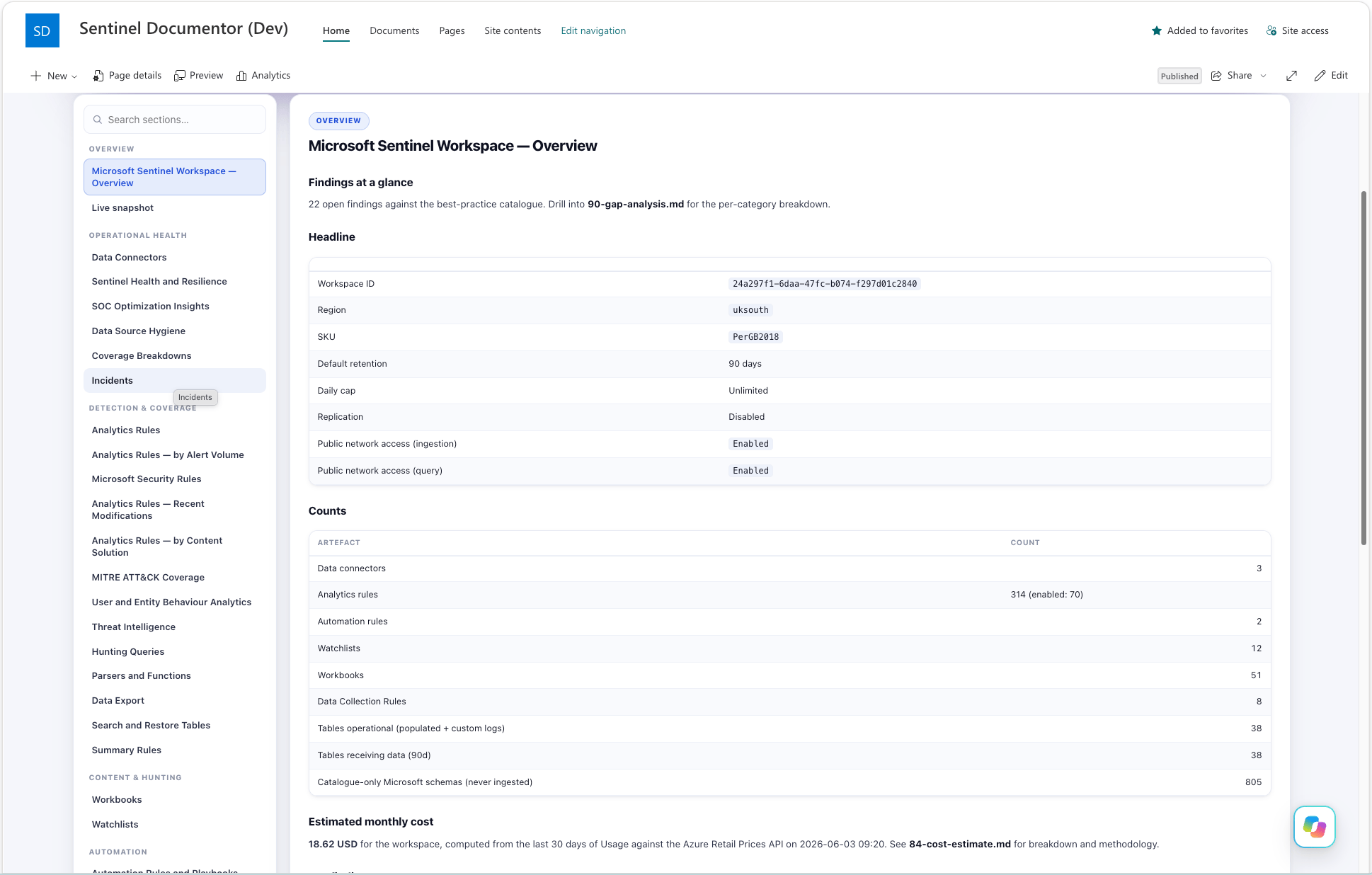
iSOC Blueprint is an interactive dashboard built from the same Documenter snapshot and published as a page on a SharePoint site. Replace one file in a document library and the page shows the new snapshot. No attachments, no portal clicking, no "is this the latest one?"
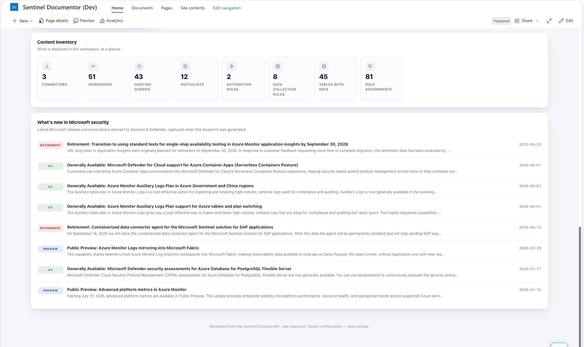
This one isn't in a release yet. It's on a branch while I finish it, so treat this post as a preview rather than an upgrade note.
The short list:
- A dashboard renderer,
Convert-SentinelInventoryToSharePoint.ps1, turns a Documenter workspace folder into one self-contained HTML file: an overview, an ingest-and-billing flow, a board of charts, the full document set and the findings. It has no Azure dependency. - A publisher,
Publish-SentinelDocsToSharePoint.ps1, uploads that file to a document library and makes sure a modern page exists to host it. It creates the page on the first run and updates in place after that. - A SharePoint Framework (SPFx) web part that loads the HTML from the library and renders it inside the page.
Nothing new is collected and no gap rules have changed. It's the same snapshot the Markdown and Word outputs use, shown somewhere people already look.
What's on the page
A dashboard nobody can find their way round is just a longer spreadsheet, so the navigation got as much attention as the charts.
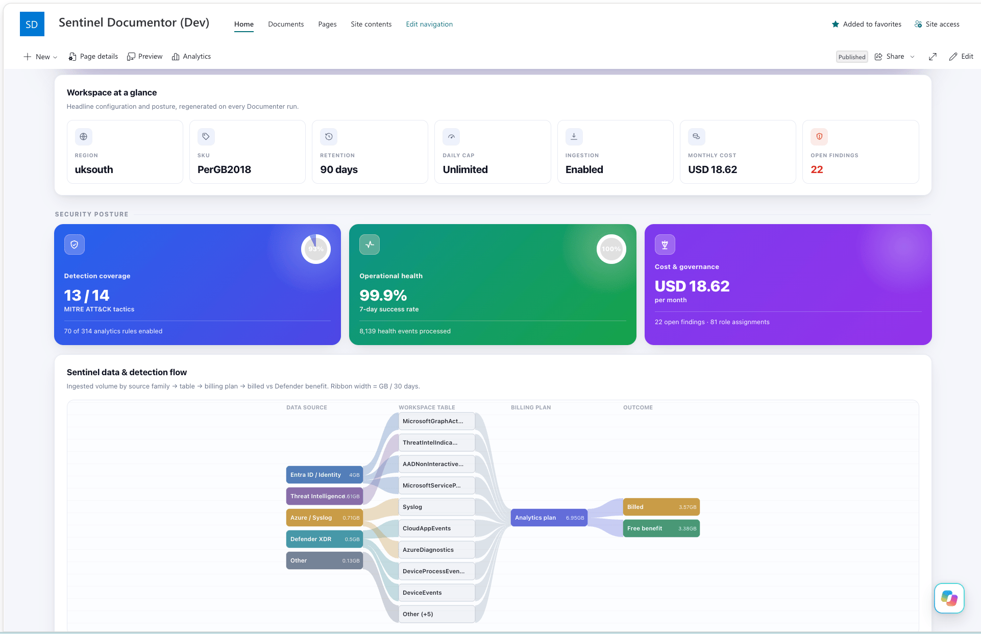
Overview opens with tiles for region, SKU, retention, daily cap, public network access for ingestion, estimated monthly cost and open findings. Click a tile and it takes you to the section that explains it. Below them are three posture cards (detection coverage, the 7-day SentinelHealth success rate, and cost alongside open findings and role assignments), then a small version of the data flow and the highest-severity findings.
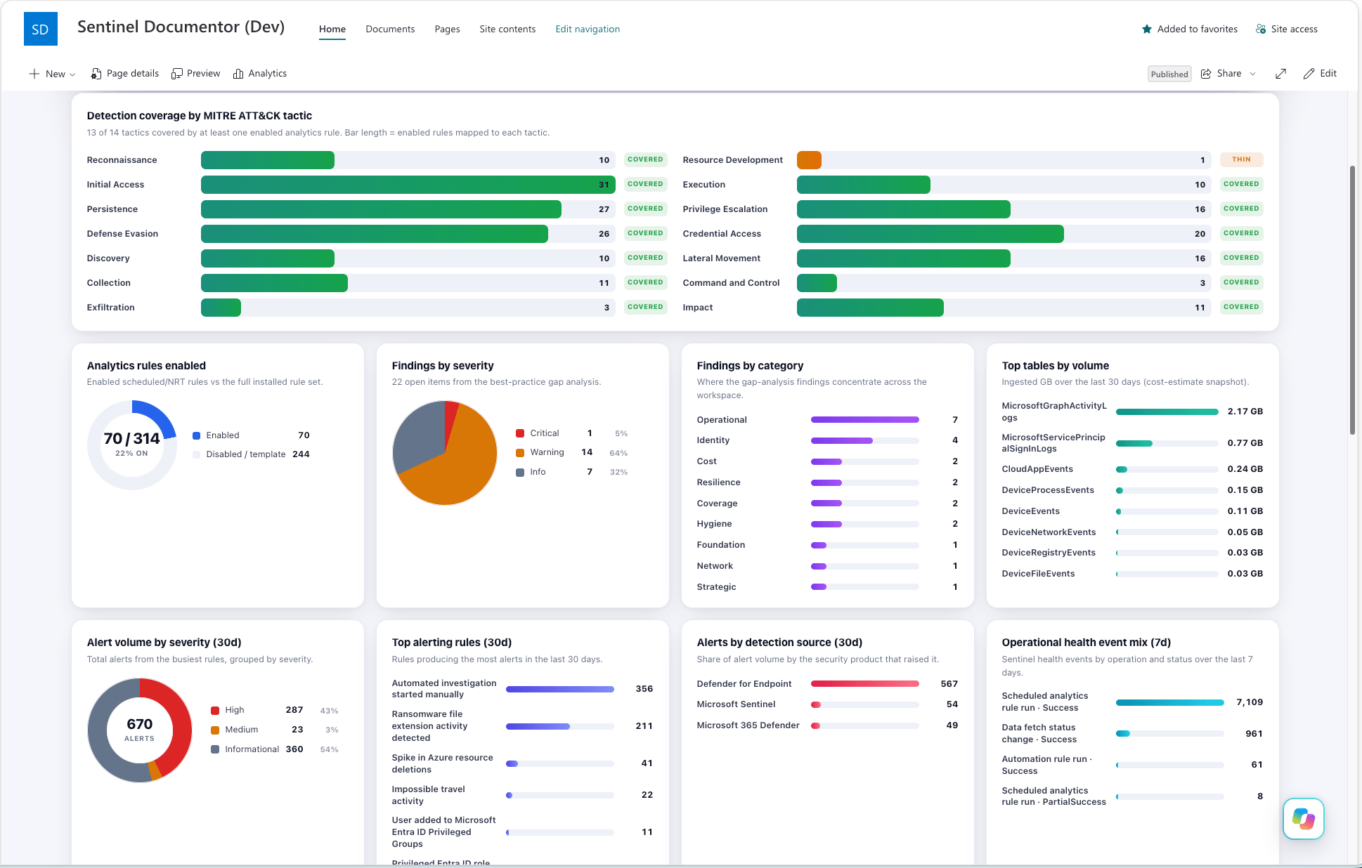
Insights leads with the panel I'd look at first: detection coverage by MITRE ATT&CK tactic, counted from the enabled analytics rules. A tactic is Covered at three or more rules mapped to it, Thin at one or two, and None at zero. A None row is a blind spot with a name on it, and a far better conversation starter than "we've got loads of rules". The rest of the board covers rules enabled versus installed, findings by severity and category, the busiest tables, the noisiest alerts and the products raising them over 30 days, the SentinelHealth event mix, the billed versus free-benefit split, a content inventory, and the What's new feed.
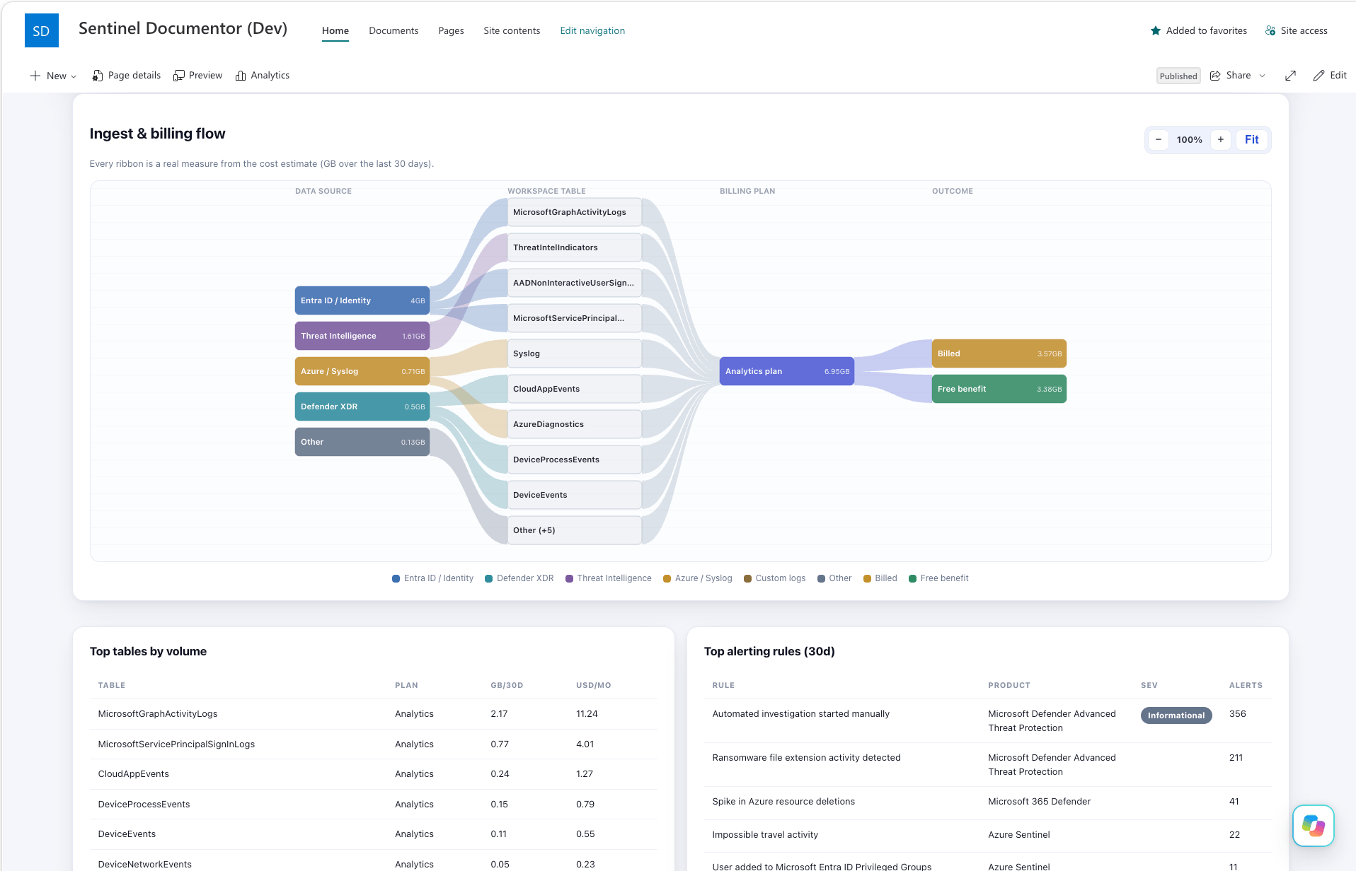
Data flow is a Sankey diagram running from source family (Entra ID, Defender XDR, Threat Intelligence, Azure and Syslog, custom logs) through each table and its billing plan, ending in billed or free benefit. Ribbons are sized from GB ingested over the last 30 days according to the cost estimate. The busiest tables get their own ribbon and the long tail rolls into a single Other node, so a busy workspace stays readable. The page draws it in plain SVG with its own script, with zoom controls. After Wave 4's long negotiation with Mermaid and Azure DevOps, drawing it myself felt less like extra effort and more like self-defence.
Sections is the whole document set with a search box, grouped into families such as Operational health, Detection & coverage, and Findings & references. Long tables get their own filter box. Small tables with a numeric column get a bar chart drawn from the table, on the basis that if the numbers are already there you might as well look at them.
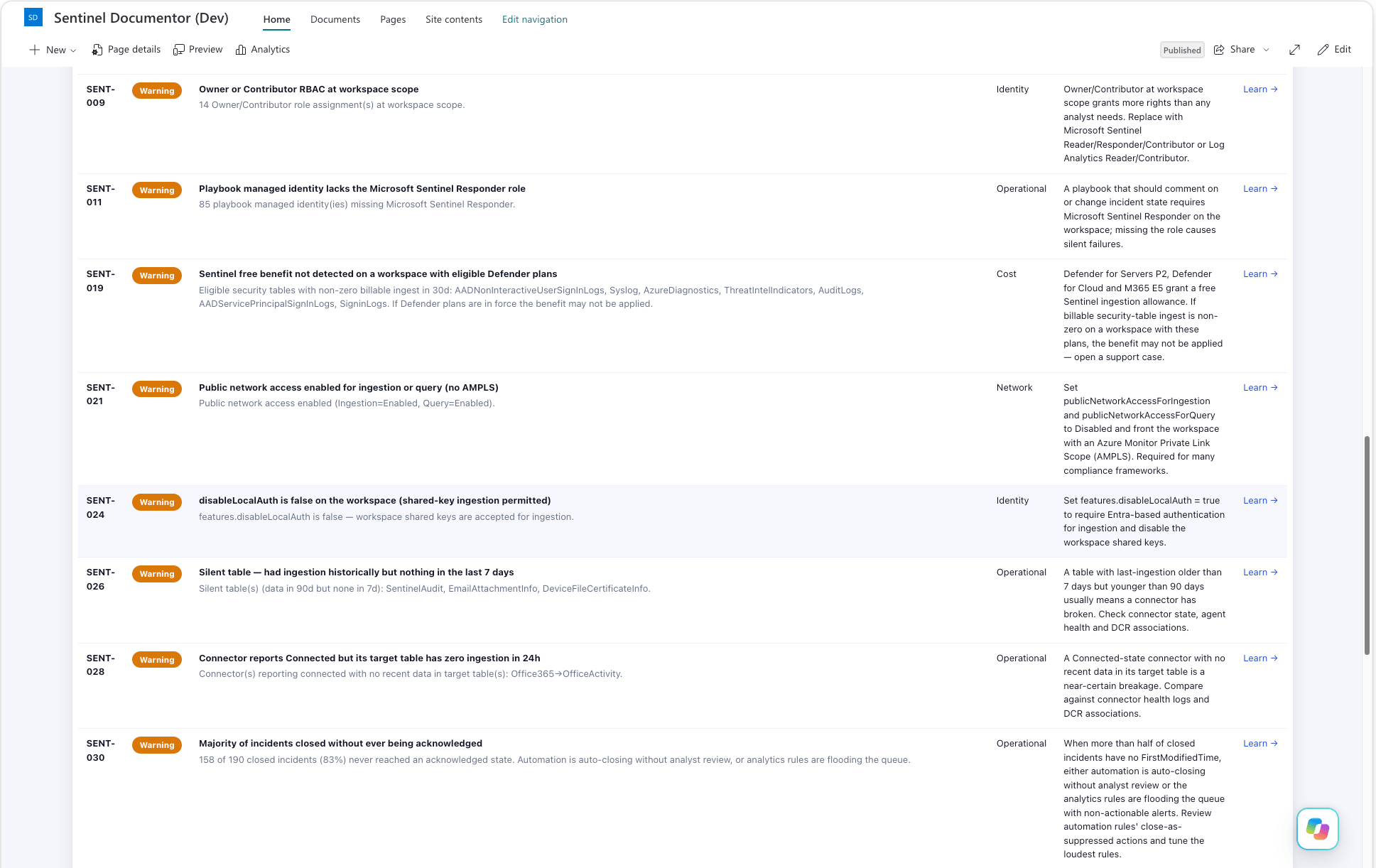
Findings lists every gap-analysis finding with its evidence, remediation and Microsoft Learn link, filterable by severity. The "Open gap analysis" button in the top bar jumps straight to the gap analysis section.
Dark mode follows your OS and remembers it if you overrule it. Not a headline feature, but it's a security dashboard. Someone will open it at two in the morning.
What this isn't (yet)
- Not released. It's on a branch, and it doesn't have a docs page yet.
- Not live. The page shows the snapshot from the last time you ran the documentor, and it's only as fresh as that.
- Still not a billing tool. The billed versus free-benefit split comes straight from the cost estimator, assumptions included. Anything it priced at zero is drawn as free benefit, and it assumes the benefit applies rather than checking. Believe the invoice.
Nobody wrote it. With any luck, somebody will now read it.
The Documenter operating guide: Docs/Tools/Documenter/Sentinel-Documenter.md. The Word path: Docs/Tools/Documenter/Sentinel-Word-Report.md. The SharePoint path doesn't have a docs page yet.
Coming soon, stay tuned...

If you've enjoyed this content and would like to support more like it, please consider subscribing. Your support helps me continue creating practical security automation content for the community.